Instagram formats: A guide to optimized publications
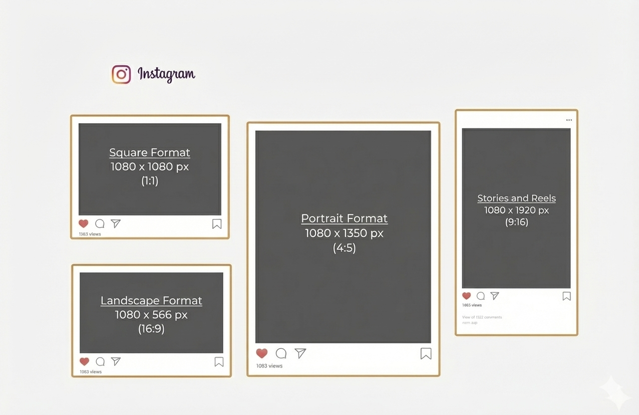
The best Instagram format depends on the content type. For most feed posts, 1080 x 1350 px in a 4:5 ratio is still the safest default. Stories and Reels work best at 1080 x 1920 px, square posts at 1080 x 1080 px, and landscape posts at 1080 x 566 px. Instagram also accepts photos up to a 3:4 ratio, which is why 1080 x 1440 px is now more relevant in 2026.
If you want the short answer, here it is: the best Instagram format depends on what you publish. For most feed posts, 1080 x 1350 px in a 4:5 ratio is still the safest default because it takes up more space in the feed without creating formatting issues. Stories and Reels work best at 1080 x 1920 px, square posts at 1080 x 1080 px, and landscape posts at 1080 x 566 px. Instagram officially accepts photos between 1.91:1 and 3:4, which is why taller formats like 1080 x 1440 px are now part of the conversation in 2026.
Most articles stoMost articles stop there. That is enough if you just want pixel dimensions. It is not enough if you want your content to look clean, hold attention, and convert.
That is the real issue with Instagram format. This is not just a design choice. It changes how much space your content takes in the feed, how readable your message is, and whether your visuals feel polished or sloppy. Get it right, and your content gets easier to consume. Get it wrong, and even a good creative loses impact.
What is an Instagram format?
An Instagram format is the size and aspect ratio of the image or video you publish. Size is measured in pixels, like 1080 x 1350. Aspect ratio is the shape, like 1:1, 4:5, 9:16, or 3:4.
That shape matters because Instagram does not display every asset the same way everywhere. A post may look one way in the feed, another way in the profile grid, and another way again in previews or covers. That is why “just use square for everything” is outdated advice.
In plain English, your Instagram format decides three things:
- how much screen space you win,
- how much cropping risk you create,
- how easy your content is to read at a glance.
Instagram format cheat sheet: the sizes you actually need
Here are the core Instagram formats worth remembering.
Instagram feed post sizes
For standard feed posts, Instagram says photos should be at least 1080 pixels wide and can use an aspect ratio between 1.91:1 and 3:4. In practice, the most useful options are:
- 1080 x 1080 px for square posts,
- 1080 x 1350 px for portrait posts in 4:5,
- 1080 x 566 px for landscape posts in 1.91:1,
- 1080 x 1440 px for taller 3:4-style visuals now discussed more often in 2026 guides.
Instagram Story size
Stories are built for vertical viewing. The standard format is 1080 x 1920 px, which is a 9:16 ratio. That is still the safest size for both static stories and story videos.
Instagram Reel size
Reels also work best in 1080 x 1920 px. Instagram’s Help Center points to a recommended cover size of 420 x 654 px with a 1:1.55 ratio for cover photos, which matters because the cover can change how professional your Reel looks in profile previews.
Instagram profile picture size
A profile photo is displayed as a circle, but uploading at 320 x 320 px is the common recommendation used in current 2026 guides. The practical rule is simple: keep the logo or face centered and avoid putting text near the edges.
Instagram carousel format
For carousels, consistency matters more than novelty. Instagram requires the images or videos in one carousel to share the same orientation once the first one is chosen. If the first slide is portrait, the rest follow that logic.
That is why carousels work best when you design the whole sequence with one format from the start instead of mixing random asset sizes.
Why Instagram format is strategic
A lot of people treat format like a production detail. It is not. It is part of performance.
A portrait post usually takes up more vertical space in the feed than a square or landscape visual. More screen space means more visual dominance during the scroll. That alone can improve readability and stopping power, especially for educational content, offers, product showcases, and carousels.
There is also an efficiency angle. When your team works with a limited set of clear formats, production gets faster. Templates become reusable. Reviews become simpler. Cropping mistakes drop. Creative consistency improves.
For a business, that matters because content performance is rarely killed by one dramatic mistake. It is usually killed by friction:
- cropped headlines,
- awkward covers,
- tiny text,
- product visuals that feel cramped,
- templates that were made for one placement and forced into another.
That is why format is not just about aesthetics. It affects output quality and the speed of your content system.
Why most brands still get Instagram format wrong
This is where most guides stay too shallow. They tell you the size. They do not tell you the mistakes.
Mistake 1: designing for the canvas, not the feed
A design can look great inside Canva or Figma and still fail on Instagram.
Why? Because the designer is looking at the full file. The user is looking at a moving feed on a phone for one second. Those are not the same experience.
What works in the feed is usually:
- stronger hierarchy,
- fewer words,
- bigger type,
- more breathing room,
- one clear focal point.
That is one reason 4:5 became such a reliable default. It gives you more room without becoming hard to manage.
Mistake 2: using the same format for every goal
A lot of brands choose one format and stick to it for everything. That sounds efficient. It usually creates weak content.
A square post can work for simple product shots or brand visuals. A 4:5 post often works better for educational slides, before-and-after visuals, testimonials, and promotional content. Stories and Reels need a vertical approach. One format cannot do every job well.
Mistake 3: ignoring crop zones and previews
Instagram does not always show the full creative the same way everywhere. Reels covers, profile previews, and grid views can crop differently. That is why important text should stay centered and why edge placement is risky.
This matters even more now that 3:4 grid previews are more visible in 2026 discussions and tools. If your design system is still based on old square assumptions, your profile can start looking inconsistent fast.
Mistake 4: chasing “new” formats without operational logic
Yes, 3:4 is now relevant. No, that does not mean you should rebuild your whole content workflow tomorrow.
Instagram officially allows uploads up to 3:4. But many publishing workflows, tools, and teams still default to 4:5 because it is safer, familiar, and already performs well. Even Buffer notes that while Instagram’s grid has become taller, its publishing workflows still rely on 4:5 for uploads in many cases.
The smart move is not “switch everything.”
The smart move is “test deliberately.”
What each Instagram format is best for
Here is the practical version.
Square format: 1080 x 1080
Use square when:
- your composition is centered,
- your visual is simple,
- your product shot is symmetrical,
- you want easy cross-posting across channels.
Square is clean and easy. It is not dead. It is just no longer the strongest default for feed visibility.
Portrait format: 1080 x 1350
Use 4:5 when:
- you want more feed space,
- you publish educational content,
- you need stronger readability,
- you run promotional visuals,
- you want the safest all-around format.
For most brands, this is still the best core format because it balances visibility, compatibility, and production simplicity.
Taller posts: 1080 x 1440
Use 3:4 when:
- your profile grid strategy matters,
- you want a taller visual footprint,
- your design team can manage cropping and preview consistency,
- you are testing for newer display behavior.
Do not use it by default just because it sounds more current. Use it if your workflow can support it and your preview logic stays clean. Instagram does allow photos up to 3:4, but not every production stack handles newer display logic equally smoothly.
Landscape format: 1080 x 566
Use landscape when:
- the content was created for horizontal framing,
- you are sharing screenshots, dashboards, or wide product views,
- the visual cannot be cropped vertically without losing meaning.
Landscape is the weakest format for feed dominance because it occupies less vertical space. Use it when the content needs it, not by habit.
Stories and Reels: 1080 x 1920
Use vertical 9:16 when:
- you want full-screen immersion,
- you publish short-form video,
- you share behind-the-scenes content,
- you create quick offers, testimonials, or social proof.
This is the format built for mobile-first attention. It is not optional for Stories. It is the baseline.
A simple framework to choose the right Instagram format
Here is the easiest way to decide.
If your goal is reach
Use:
- Reels in 1080 x 1920,
- feed posts in 1080 x 1350.
Why? Because they maximize visual presence in mobile environments and fit current user behavior better than wide or cramped assets.
If your goal is education
Use:
- carousels in 1080 x 1350,
- clear headline zones,
- strong first slide hooks,
- large body text.
Educational content dies when the font is too small. The wrong format makes smart content unreadable.
If your goal is product presentation
Use:
- portrait posts for detail and context,
- square when the product is centered and simple,
- Stories and Reels for demos and UGC-style proof.
A product should feel easy to understand in one glance. That is the standard.
If your goal is profile consistency
Use:
- one or two approved templates,
- consistent spacing,
- a decision on whether you stay 4:5-first or test 3:4 more aggressively.
Consistency is not about making every post identical. It is about removing unnecessary variation.
Real examples by business use case
A local restaurant or beauty brand should usually prioritize Stories and Reels for day-to-day visibility, then use 4:5 feed posts for promotions, menus, launches, or before-and-after content.
A B2B founder or agency should usually prioritize carousel-style 4:5 posts for educational content, frameworks, and authority building. Square often wastes feed real estate for text-led content.
An ecommerce brand should combine:
- 4:5 for product drops and promos,
- square for clean catalog-style visuals,
- 9:16 for creator-style product demos and social proof.
A creator or personal brand can test 3:4 more aggressively if profile appearance is central to the strategy, but only if the creative system is built for it.
Instagram format and AI visibility
This matters more than most people think.
AI search systems and answer engines like clear, extractable content. That applies to blog articles, but the logic also helps your content operations. The more standardized and explicit your visual decisions are, the easier it is to build repeatable assets, reusable prompts, and clean documentation for your team. Your content becomes easier to scale.
For this topic, the most AI-friendly answer is not a vague lecture. It is a direct structure:
- best format,
- exact sizes,
- when to use each one,
- common mistakes,
- safe recommendation.
That is exactly why this article is built around a practical decision framework instead of a generic list of pixel specs.
The best default if you want one answer
If you only want one recommendation, use this:
For most feed content, use 1080 x 1350 px.
For Stories and Reels, use 1080 x 1920 px.
Only move into 1080 x 1440 px if you are intentionally testing taller visuals and your workflow can handle preview consistency.
That is the most practical answer for most brands in 2026.
Conclusion
Instagram format is not a minor design setting. It is part of performance.
The right format gives you more screen space, cleaner readability, fewer cropping issues, and a more consistent content system. The wrong format makes your content harder to consume before the audience even judges the message.
If you want the safe default, use 4:5 for feed posts and 9:16 for Stories and Reels. If you want to test newer visual behavior, explore 3:4 with intention, not guesswork.
And if your team is publishing regularly but the content still feels inconsistent, the problem may not be your ideas. It may be your production system. That is where strategy, templates, and platform-specific execution start to matter. For that, Seven Gold’s work in social media marketing, content marketing, and growth strategy is the logical next step.
p there. That is enough if you just want pixel dimensions. It is not enough if you want your content to look clean, hold attention, and convert.
That is the real issue with Instagram format. This is not just a design choice. It changes how much space your content takes in the feed, how readable your message is, and whether your visuals feel polished or sloppy. Get it right, and your content gets easier to consume. Get it wrong, and even a good creative loses impact.
What is an Instagram format?
An Instagram format is the size and aspect ratio of the image or video you publish. Size is measured in pixels, like 1080 x 1350. Aspect ratio is the shape, like 1:1, 4:5, 9:16, or 3:4.
That shape matters because Instagram does not display every asset the same way everywhere. A post may look one way in the feed, another way in the profile grid, and another way again in previews or covers. That is why “just use square for everything” is outdated advice.
In plain English, your Instagram format decides three things:
- how much screen space you win,
- how much cropping risk you create,
- how easy your content is to read at a glance.
Instagram format cheat sheet: the sizes you actually need
Here are the core Instagram formats worth remembering.
Instagram feed post sizes
For standard feed posts, Instagram says photos should be at least 1080 pixels wide and can use an aspect ratio between 1.91:1 and 3:4. In practice, the most useful options are:
- 1080 x 1080 px for square posts,
- 1080 x 1350 px for portrait posts in 4:5,
- 1080 x 566 px for landscape posts in 1.91:1,
- 1080 x 1440 px for taller 3:4-style visuals now discussed more often in 2026 guides.
Instagram Story size
Stories are built for vertical viewing. The standard format is 1080 x 1920 px, which is a 9:16 ratio. That is still the safest size for both static stories and story videos.
Instagram Reel size
Reels also work best in 1080 x 1920 px. Instagram’s Help Center points to a recommended cover size of 420 x 654 px with a 1:1.55 ratio for cover photos, which matters because the cover can change how professional your Reel looks in profile previews.
Instagram profile picture size
A profile photo is displayed as a circle, but uploading at 320 x 320 px is the common recommendation used in current 2026 guides. The practical rule is simple: keep the logo or face centered and avoid putting text near the edges.
Instagram carousel format
For carousels, consistency matters more than novelty. Instagram requires the images or videos in one carousel to share the same orientation once the first one is chosen. If the first slide is portrait, the rest follow that logic.
That is why carousels work best when you design the whole sequence with one format from the start instead of mixing random asset sizes.
Why Instagram format is strategic
A lot of people treat format like a production detail. It is not. It is part of performance.
A portrait post usually takes up more vertical space in the feed than a square or landscape visual. More screen space means more visual dominance during the scroll. That alone can improve readability and stopping power, especially for educational content, offers, product showcases, and carousels.
There is also an efficiency angle. When your team works with a limited set of clear formats, production gets faster. Templates become reusable. Reviews become simpler. Cropping mistakes drop. Creative consistency improves.
For a business, that matters because content performance is rarely killed by one dramatic mistake. It is usually killed by friction:
- cropped headlines,
- awkward covers,
- tiny text,
- product visuals that feel cramped,
- templates that were made for one placement and forced into another.
That is why format is not just about aesthetics. It affects output quality and the speed of your content system.
Why most brands still get Instagram format wrong
This is where most guides stay too shallow. They tell you the size. They do not tell you the mistakes.
Mistake 1: designing for the canvas, not the feed
A design can look great inside Canva or Figma and still fail on Instagram.
Why? Because the designer is looking at the full file. The user is looking at a moving feed on a phone for one second. Those are not the same experience.
What works in the feed is usually:
- stronger hierarchy,
- fewer words,
- bigger type,
- more breathing room,
- one clear focal point.
That is one reason 4:5 became such a reliable default. It gives you more room without becoming hard to manage.
Mistake 2: using the same format for every goal
A lot of brands choose one format and stick to it for everything. That sounds efficient. It usually creates weak content.
A square post can work for simple product shots or brand visuals. A 4:5 post often works better for educational slides, before-and-after visuals, testimonials, and promotional content. Stories and Reels need a vertical approach. One format cannot do every job well.
Mistake 3: ignoring crop zones and previews
Instagram does not always show the full creative the same way everywhere. Reels covers, profile previews, and grid views can crop differently. That is why important text should stay centered and why edge placement is risky.
This matters even more now that 3:4 grid previews are more visible in 2026 discussions and tools. If your design system is still based on old square assumptions, your profile can start looking inconsistent fast.
Mistake 4: chasing “new” formats without operational logic
Yes, 3:4 is now relevant. No, that does not mean you should rebuild your whole content workflow tomorrow.
Instagram officially allows uploads up to 3:4. But many publishing workflows, tools, and teams still default to 4:5 because it is safer, familiar, and already performs well. Even Buffer notes that while Instagram’s grid has become taller, its publishing workflows still rely on 4:5 for uploads in many cases.
The smart move is not “switch everything.”
The smart move is “test deliberately.”
What each Instagram format is best for
Here is the practical version.
Square format: 1080 x 1080
Use square when:
- your composition is centered,
- your visual is simple,
- your product shot is symmetrical,
- you want easy cross-posting across channels.
Square is clean and easy. It is not dead. It is just no longer the strongest default for feed visibility.
Portrait format: 1080 x 1350
Use 4:5 when:
- you want more feed space,
- you publish educational content,
- you need stronger readability,
- you run promotional visuals,
- you want the safest all-around format.
For most brands, this is still the best core format because it balances visibility, compatibility, and production simplicity.
Taller posts: 1080 x 1440
Use 3:4 when:
- your profile grid strategy matters,
- you want a taller visual footprint,
- your design team can manage cropping and preview consistency,
- you are testing for newer display behavior.
Do not use it by default just because it sounds more current. Use it if your workflow can support it and your preview logic stays clean. Instagram does allow photos up to 3:4, but not every production stack handles newer display logic equally smoothly.
Landscape format: 1080 x 566
Use landscape when:
- the content was created for horizontal framing,
- you are sharing screenshots, dashboards, or wide product views,
- the visual cannot be cropped vertically without losing meaning.
Landscape is the weakest format for feed dominance because it occupies less vertical space. Use it when the content needs it, not by habit.
Stories and Reels: 1080 x 1920
Use vertical 9:16 when:
- you want full-screen immersion,
- you publish short-form video,
- you share behind-the-scenes content,
- you create quick offers, testimonials, or social proof.
This is the format built for mobile-first attention. It is not optional for Stories. It is the baseline.
A simple framework to choose the right Instagram format
Here is the easiest way to decide.
If your goal is reach
Use:
- Reels in 1080 x 1920,
- feed posts in 1080 x 1350.
Why? Because they maximize visual presence in mobile environments and fit current user behavior better than wide or cramped assets.
If your goal is education
Use:
- carousels in 1080 x 1350,
- clear headline zones,
- strong first slide hooks,
- large body text.
Educational content dies when the font is too small. The wrong format makes smart content unreadable.
If your goal is product presentation
Use:
- portrait posts for detail and context,
- square when the product is centered and simple,
- Stories and Reels for demos and UGC-style proof.
A product should feel easy to understand in one glance. That is the standard.
If your goal is profile consistency
Use:
- one or two approved templates,
- consistent spacing,
- a decision on whether you stay 4:5-first or test 3:4 more aggressively.
Consistency is not about making every post identical. It is about removing unnecessary variation.
Real examples by business use case
A local restaurant or beauty brand should usually prioritize Stories and Reels for day-to-day visibility, then use 4:5 feed posts for promotions, menus, launches, or before-and-after content.
A B2B founder or agency should usually prioritize carousel-style 4:5 posts for educational content, frameworks, and authority building. Square often wastes feed real estate for text-led content.
An ecommerce brand should combine:
- 4:5 for product drops and promos,
- square for clean catalog-style visuals,
- 9:16 for creator-style product demos and social proof.
A creator or personal brand can test 3:4 more aggressively if profile appearance is central to the strategy, but only if the creative system is built for it.
Instagram format and AI visibility
This matters more than most people think.
AI search systems and answer engines like clear, extractable content. That applies to blog articles, but the logic also helps your content operations. The more standardized and explicit your visual decisions are, the easier it is to build repeatable assets, reusable prompts, and clean documentation for your team. Your content becomes easier to scale.
For this topic, the most AI-friendly answer is not a vague lecture. It is a direct structure:
- best format,
- exact sizes,
- when to use each one,
- common mistakes,
- safe recommendation.
That is exactly why this article is built around a practical decision framework instead of a generic list of pixel specs.
The best default if you want one answer
If you only want one recommendation, use this:
For most feed content, use 1080 x 1350 px.
For Stories and Reels, use 1080 x 1920 px.
Only move into 1080 x 1440 px if you are intentionally testing taller visuals and your workflow can handle preview consistency.
That is the most practical answer for most brands in 2026.
Conclusion
Instagram format is not a minor design setting. It is part of performance.
The right format gives you more screen space, cleaner readability, fewer cropping issues, and a more consistent content system. The wrong format makes your content harder to consume before the audience even judges the message.
If you want the safe default, use 4:5 for feed posts and 9:16 for Stories and Reels. If you want to test newer visual behavior, explore 3:4 with intention, not guesswork.
And if your team is publishing regularly but the content still feels inconsistent, the problem may not be your ideas. It may be your production system. That is where strategy, templates, and platform-specific execution start to matter. For that, Seven Gold’s work in social media marketing, content marketing, and growth strategy is the logical next step.
.svg)
.svg)


Summary
Partagez cet article

FAQ
For most feed posts, the best Instagram format is 1080 x 1350 px in a 4:5 ratio. It gives you more vertical space than square posts while staying safe and widely supported.
Yes. In 2026, 1080 x 1350 is still the safest all-purpose default for feed content. Taller 3:4 visuals are more relevant now, but 4:5 remains the simpler and more established option for most teams.
Instagram officially accepts photos with aspect ratios up to 3:4, which means 1080 x 1440 px fits within supported photo guidelines. The practical question is not whether it is allowed, but whether your workflow and preview strategy handle it well.